



Categories
A new way to find people through shared interests, plans, and context.

My role
Product Designer
Scope
UX architecture, user flows, visual direction, MVP design
MVP currently in development
Some screens in this case have been simplified or recreated for confidentiality. The focus is the product thinking and process behind the MVP, not the exact interface.
Context
Unlike most dating apps, this one has full user search. People can find matches using specific filters, including tags they add to their own profile.
Business problem
Tags described a person in general, not their current intent. Someone who doesn't drink might still want to join friends at a bar. Someone who doesn't list travel as a core interest might be planning a trip and looking for a travel buddy. Standard profile search couldn't catch these situational cases.
The tag system added its own friction: too many tags, overlapping meanings, and inconsistent wording for the same interest.
Goal
Help users find matches based on what they're looking for right now — not just static profile tags.
Task
Rethink the existing search flow and design a new way to find people based on current interests and intent.
Categories
Each space brings people together around a shared activity or idea.
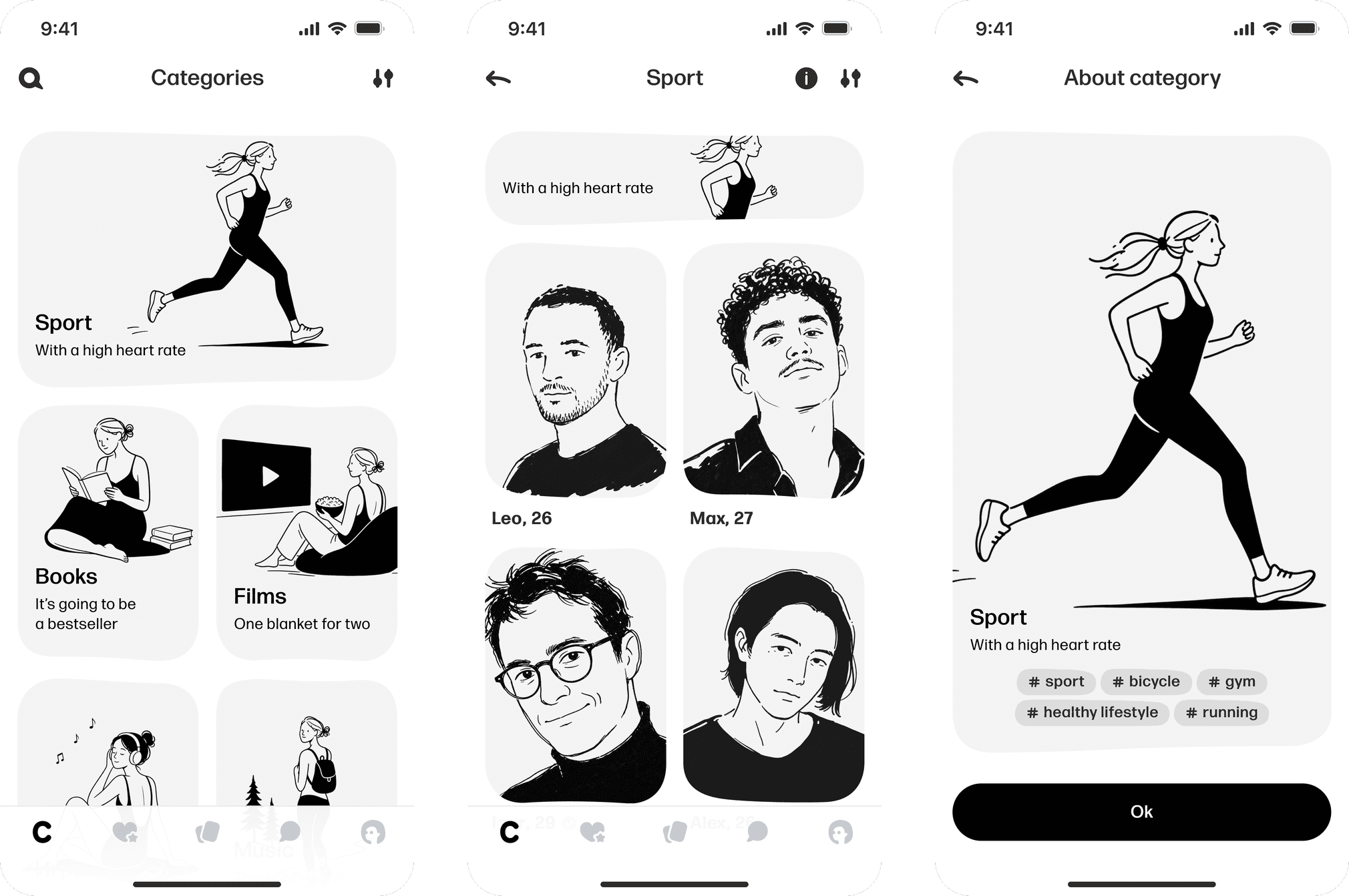
New navigation
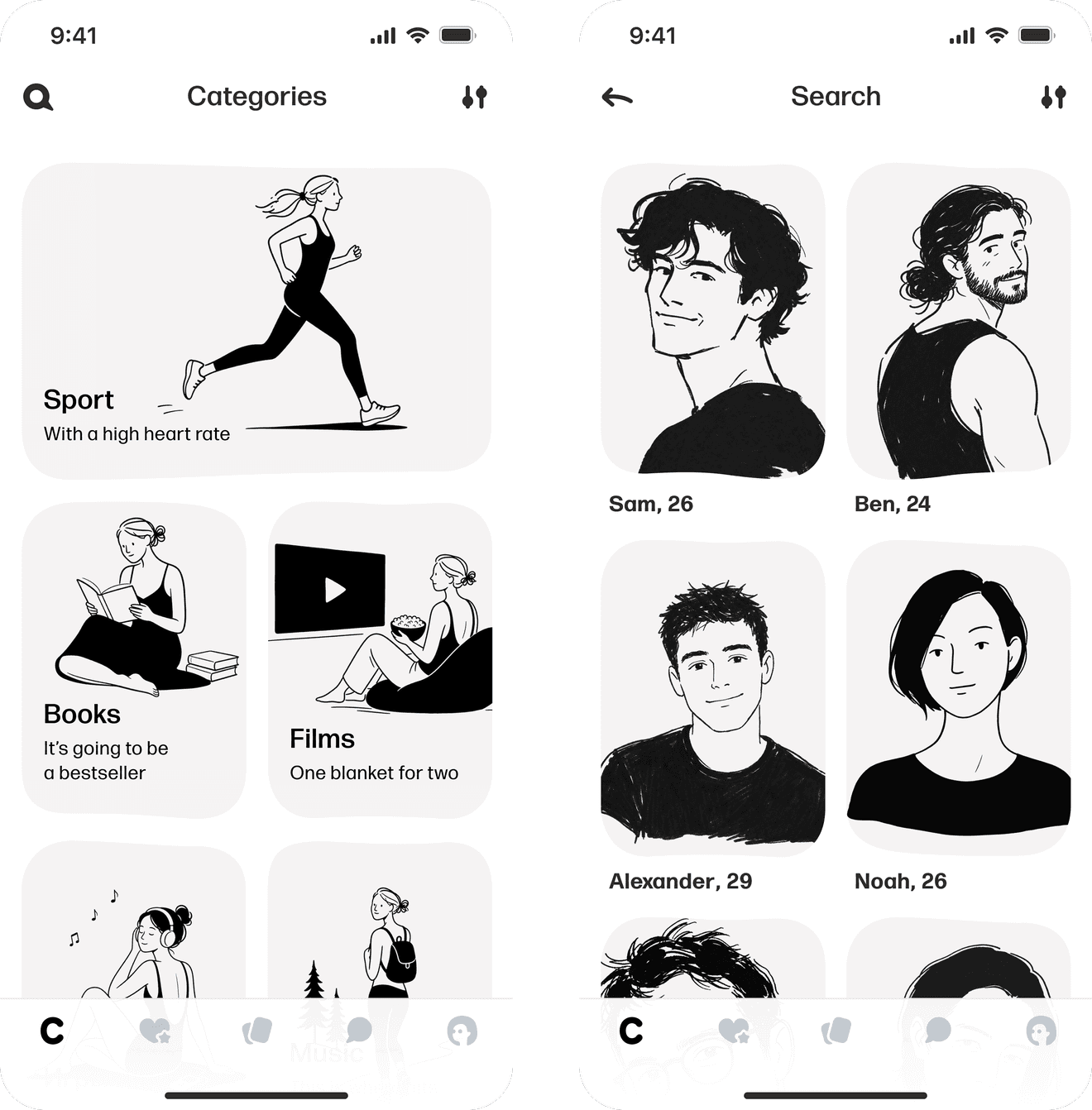
Navigation was one of the key decisions on this project. We had two options: keep search as the primary flow and fold the new section into it, or make the new section the app's main entry point and keep search as a secondary tool. We chose the second option, with search still available inside the new section. This let us introduce the new flow without taking away the search users already relied on.
Search was a standalone tab
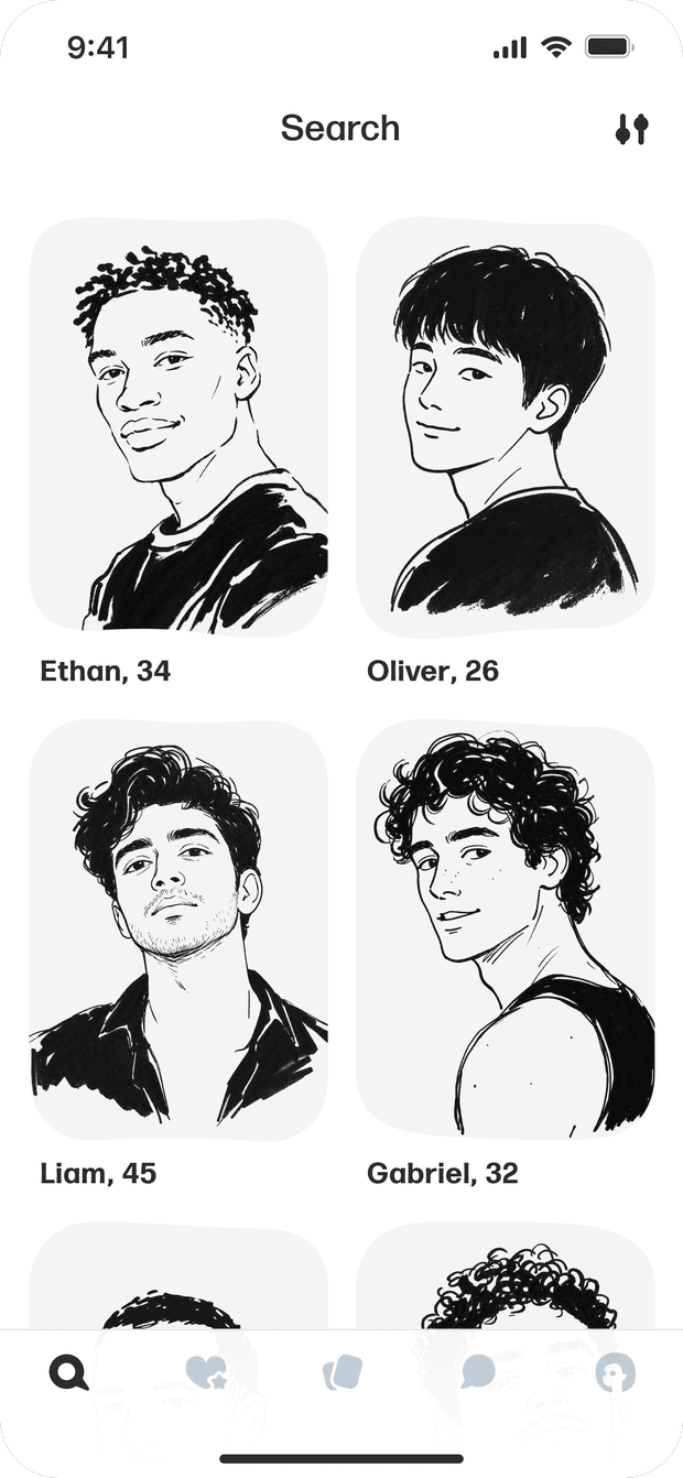
The new section became a standalone tab
Search moved inside it
Simplifying the flow
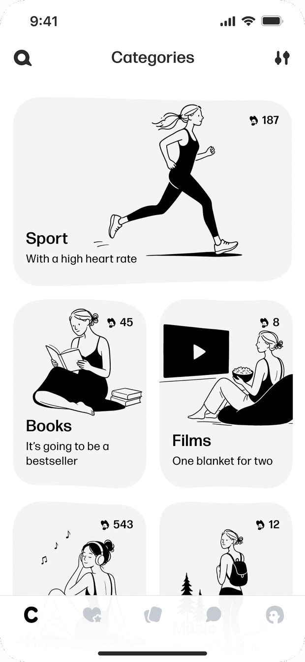
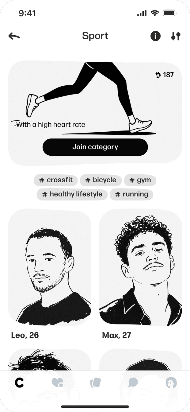
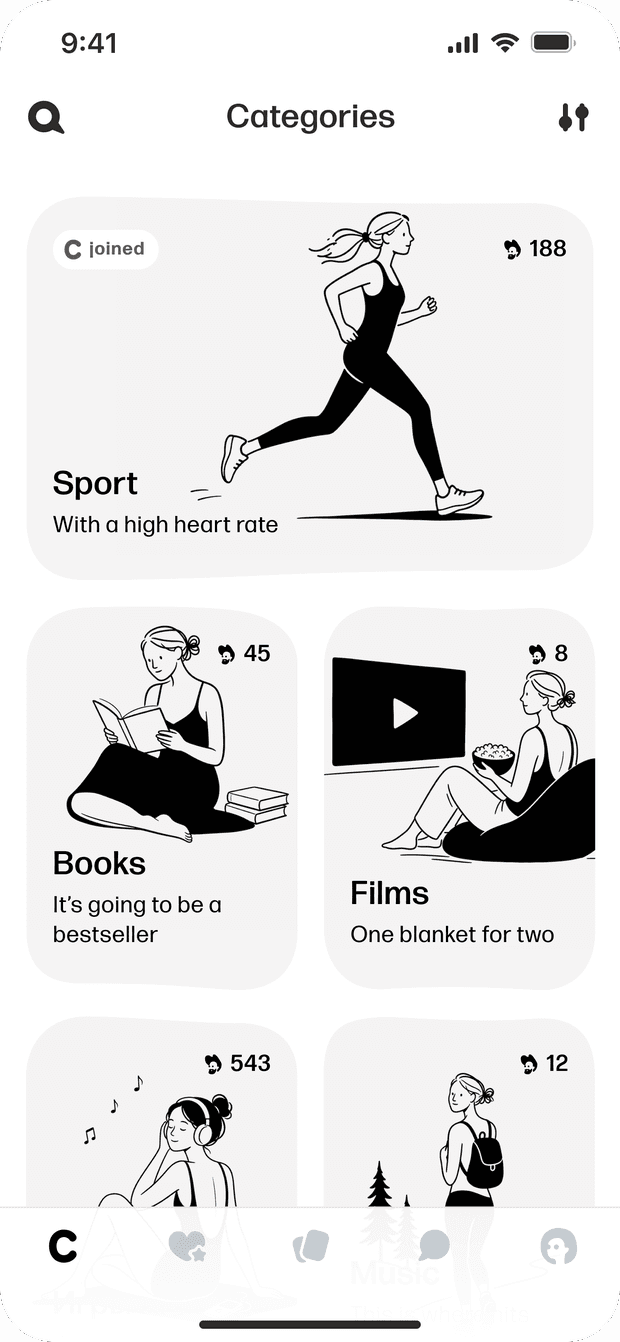
The original concept had users join these spaces like communities. Each card would show a member count — a social signal meant to draw users' attention to the category.
One question came up during scenario design: what does joining actually give the user?
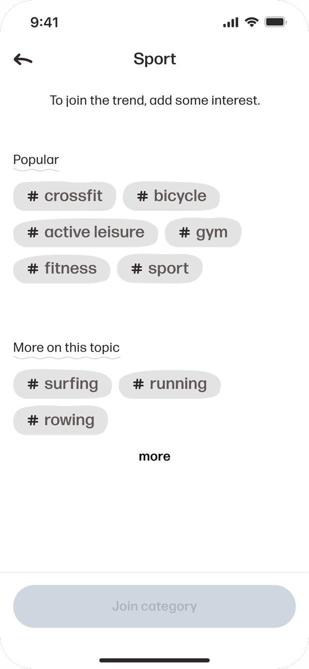
The mechanic added a lot of hidden complexity:
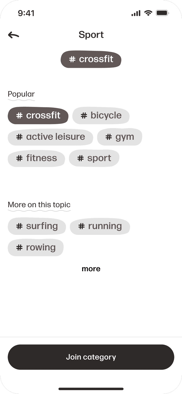
- Joining meant adding a matching tag to your profile.
- Tags were capped, so hitting the limit meant removing or swapping an existing interest.
- Leaving a space meant editing tags again.
- We'd also need to explain where to find your spaces and how to manage membership.
- At launch, cards could show very few members — or none at all.
A simple action was turning into a long flow touching the profile, settings, and tag system — without adding real value. After testing the scenarios, we dropped the membership mechanic. In the final version, users just open a space and browse people who share that interest.
Visual style
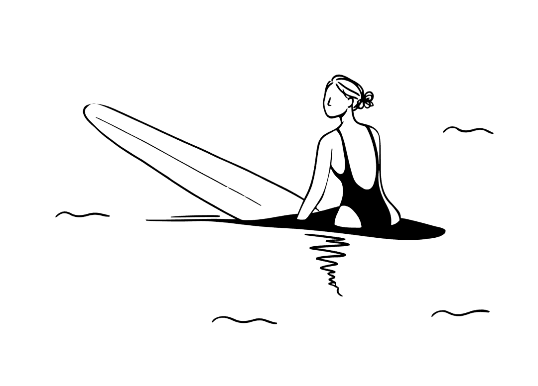
We built 17 categories for the MVP based on the most popular user tags. Each one needed its own visual cover. To keep the app's visual language intact, we used recognizable metaphors instead of plain photos.
We explored several visual directions and landed on metaphorical covers that matched the product's style. I owned the concepts and visual metaphors for each category. A senior designer illustrated five key covers; I generated the rest in Midjourney, keeping them consistent with the overall visual system. This let us test the hypothesis quickly without spending resources on fully illustrating all 17 categories before launch.
The best waves can't be rushed...
Some visual explorations from this project remain confidential. This case focuses on the product decisions behind the MVP.
Growth opportunities
The architecture supports temporary categories, not just permanent ones — around festivals, concerts, or other time-bound events, for example. This opens the door to partnership and advertising integrations without changing the product's core flow.
MVP
As of this write-up, Categories is at MVP stage. The next step is testing which categories users actually engage with, and whether the new flow helps people find others through shared interests and context.